Sessão de Rua, an app for Porto Alegre’s street cinemas
A course project in which I ran user research from start to finish. A survey with 30 responses and two interviews showed that people miss screenings because they don’t hear about them, and that became an app prototype with the listings of all four cinemas in one place.
Individual project for the UX do Zero ao Case course
Role
Research, ideation, UX and UI for the app
Team
Just me
Timeline
April to June 2026
Tools
FigJam, Figma, Google Forms, Google Meet, Tactiq and Excel
Outcome
A 12-screen clickable prototype, grounded in the research
Context
I took the UX do Zero ao Case course to get hands-on practice with user research, and this was my individual project. Porto Alegre has four active street cinemas, independent theaters with their own buildings outside shopping malls, all of them downtown: Cinemateca Capitólio, CineBancários, Sala Redenção (run by the federal university, UFRGS) and Cinemateca Paulo Amorim. Each one posts its listings on its own website or blog and on Instagram. The project looked into how people find out about these screenings and ended in an app prototype to see everything in one place.
The research was done in Portuguese, with people in Brazil. The boards and screens on this page were translated into English for the portfolio; the originals are on the Portuguese version.
Problem
Film lovers in Porto Alegre struggle to keep up with what the street cinemas are showing. The listings are spread across four websites and Instagram profiles, and not every post reaches the people who follow the cinemas. People find out about screenings too late, or never. Of the 30 people who answered the survey, 19 (63%) had missed a screening because they didn’t know about it, and 11 (37%) go to street cinemas, against 27 (90%) who go to multiplexes.
My role
I did every stage on my own: the research, the synthesis, the ideation, the visual foundations, the components, the 12 screens and the clickable prototype.
Process
Research
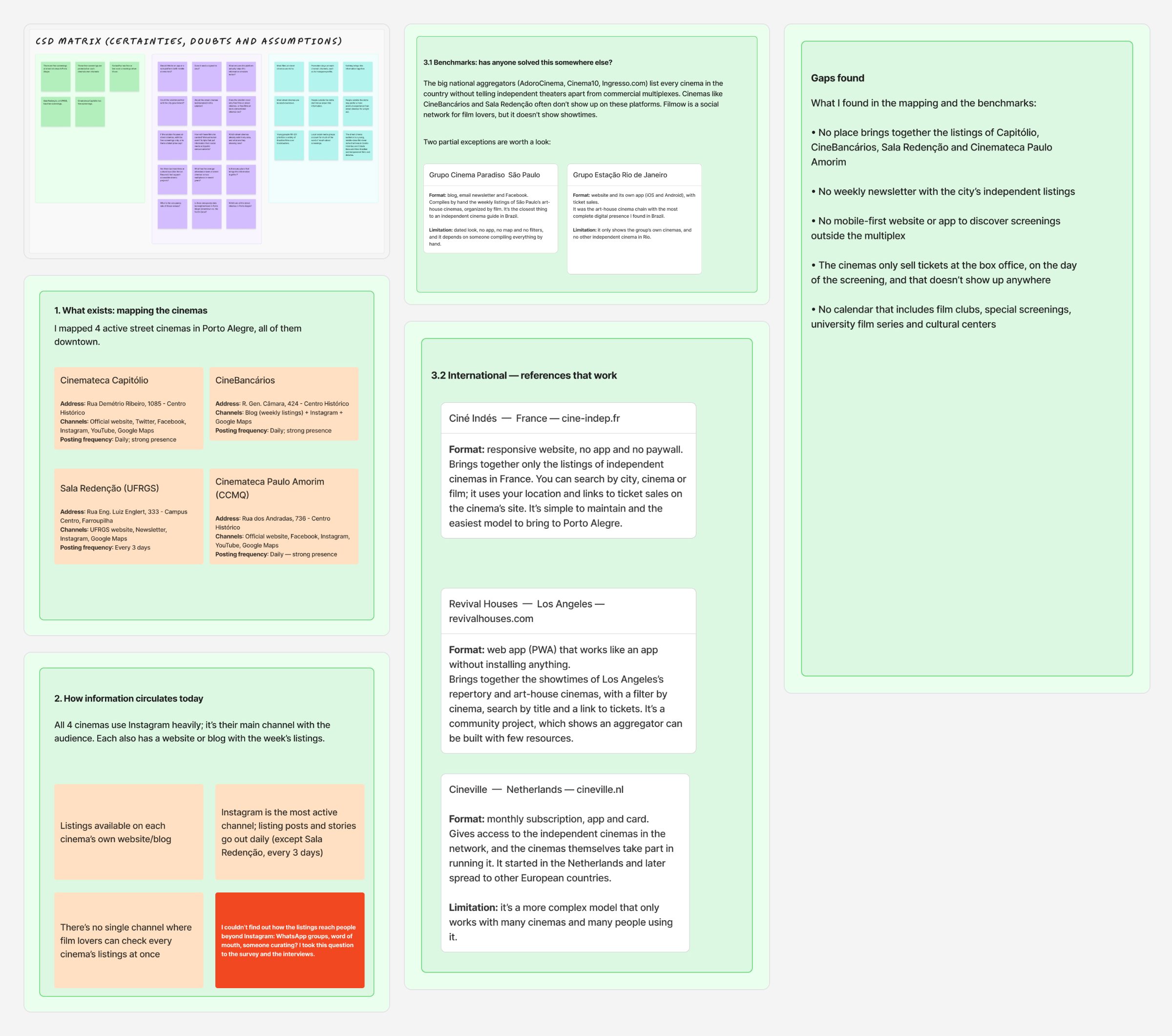
I started with a CSD matrix, to sort what I knew into certainties, doubts and assumptions. Then I mapped the four cinemas and how each one shares its listings: all of them use Instagram as their main channel and keep a website or blog with the weekly listings, and no channel brings the four together. In the benchmarks, the national aggregators (AdoroCinema, Cinema10 and Ingresso.com) list cinemas from all over the country without telling independent theaters apart from multiplexes, and abroad I looked at Ciné Indés (France), Revival Houses (Los Angeles) and Cineville (the Netherlands). None of them brings Capitólio, CineBancários, Sala Redenção and Cinemateca Paulo Amorim together in one place.
The first stage’s board, zoomed out: CSD matrix, cinema mapping, benchmarks and gaps.
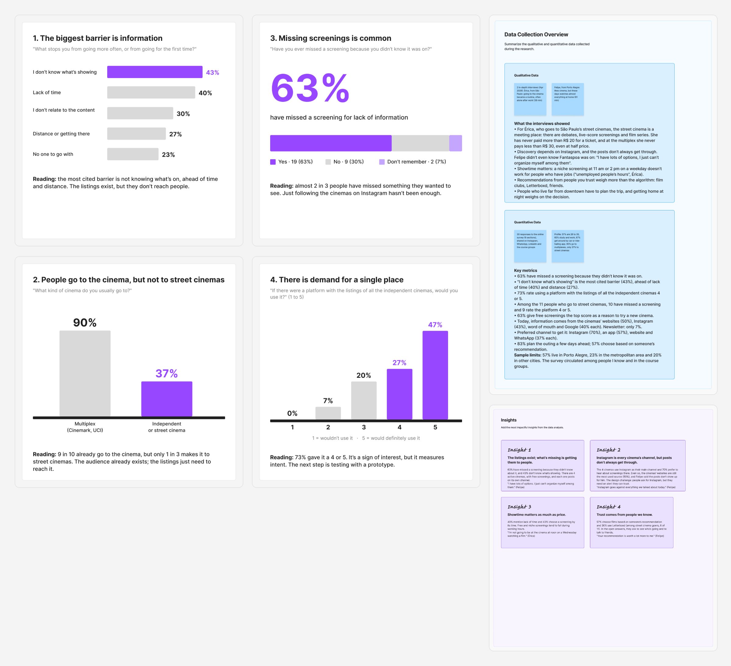
I ran a survey on Google Forms, shared on Instagram, WhatsApp, LinkedIn and in the course groups, which got 30 responses in under 24 hours, between April 8 and 9, 2026. It’s a convenience sample, good for exploring hypotheses rather than generalizing: 17 people live in Porto Alegre (57%), 7 in the metropolitan area (23%) and 6 in other cities (20%). I tabulated the answers in Excel. The main barrier mentioned is not knowing what’s showing (13 of 30), ahead of lack of time (12) and distance (8).
Then I separated the 11 people who go to street cinemas, the group closest to the people who would use the app. Among them, 10 had missed a screening because they didn’t know about it, and 9 rate a platform with all the listings 4 or 5. Six of them use Letterboxd, against 9 of the 30 people overall.
I also ran two in-depth interviews over Google Meet, of 38 and 61 minutes, transcribed with Tactiq, with Felipe, from Porto Alegre, and Érica, who lives in São Paulo and goes to the street cinemas there. I already knew both of them, and they agreed to the use of their first names. Felipe said the cinemas’ Instagram posts don’t reach him and that events sell out before he hears about them. Érica talked about debates and film series as part of the outing, said she had never paid more than R$ 20 at a street cinema in São Paulo, against at least R$ 30 at a multiplex even with a half-price ticket, and pointed out that the cheapest screenings fall on weekdays, during working hours.
The survey and interview data, zoomed out, and the four insights that came from them.
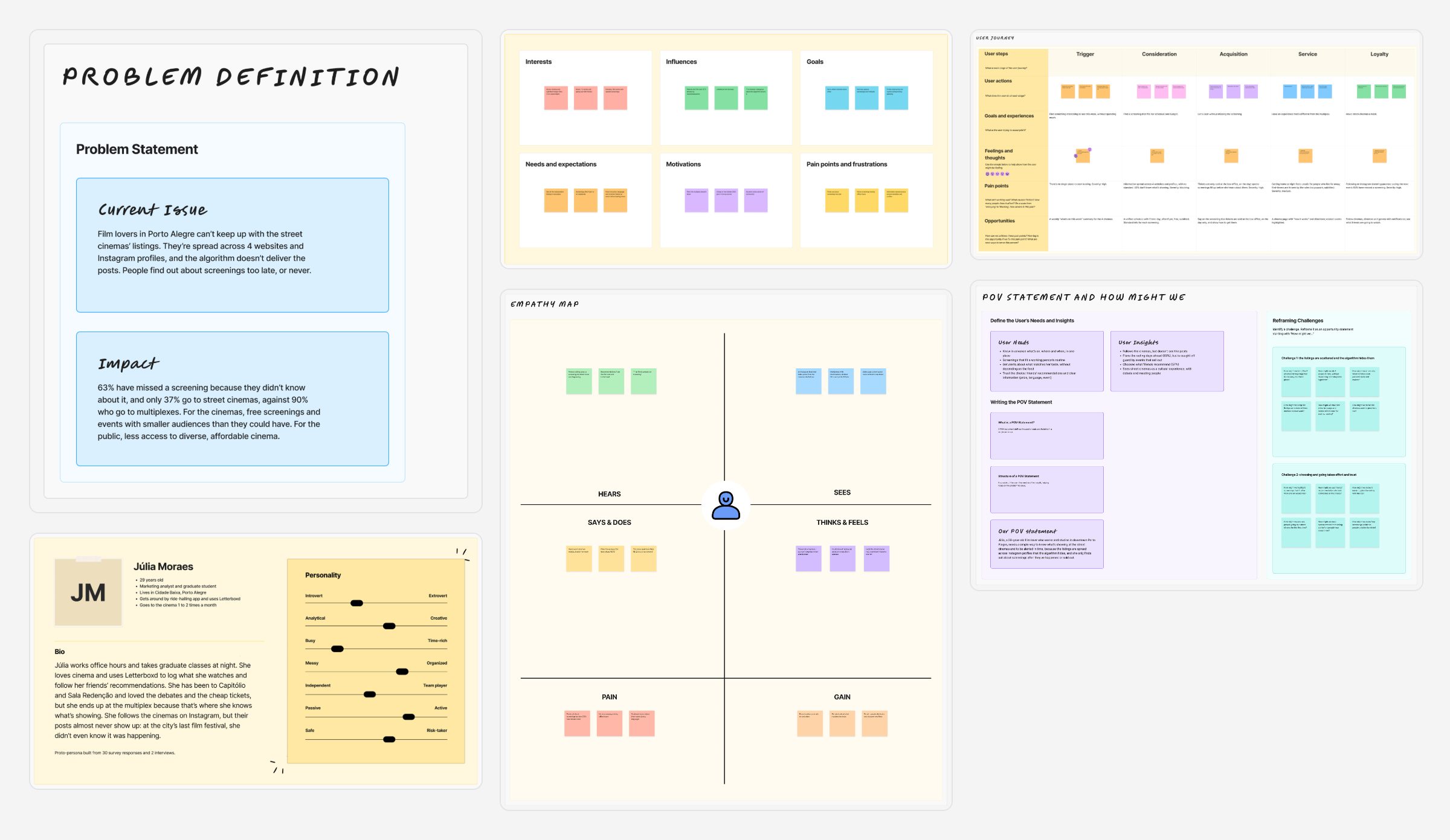
The analysis produced four insights. The listings exist, but they don’t reach people. Instagram is every cinema’s channel and the favorite of 21 of the 30 people, but posts don’t always reach followers. Showtime matters as much as price. And a recommendation from someone you know weighs more than the algorithm: 17 of the 30 people (57%) choose films that way. With them I built the proto-persona Júlia, the journey and the point of view, and turned the challenges into How Might We questions.
The synthesis, zoomed out: problem, persona, empathy map, journey and POV.
Ideation
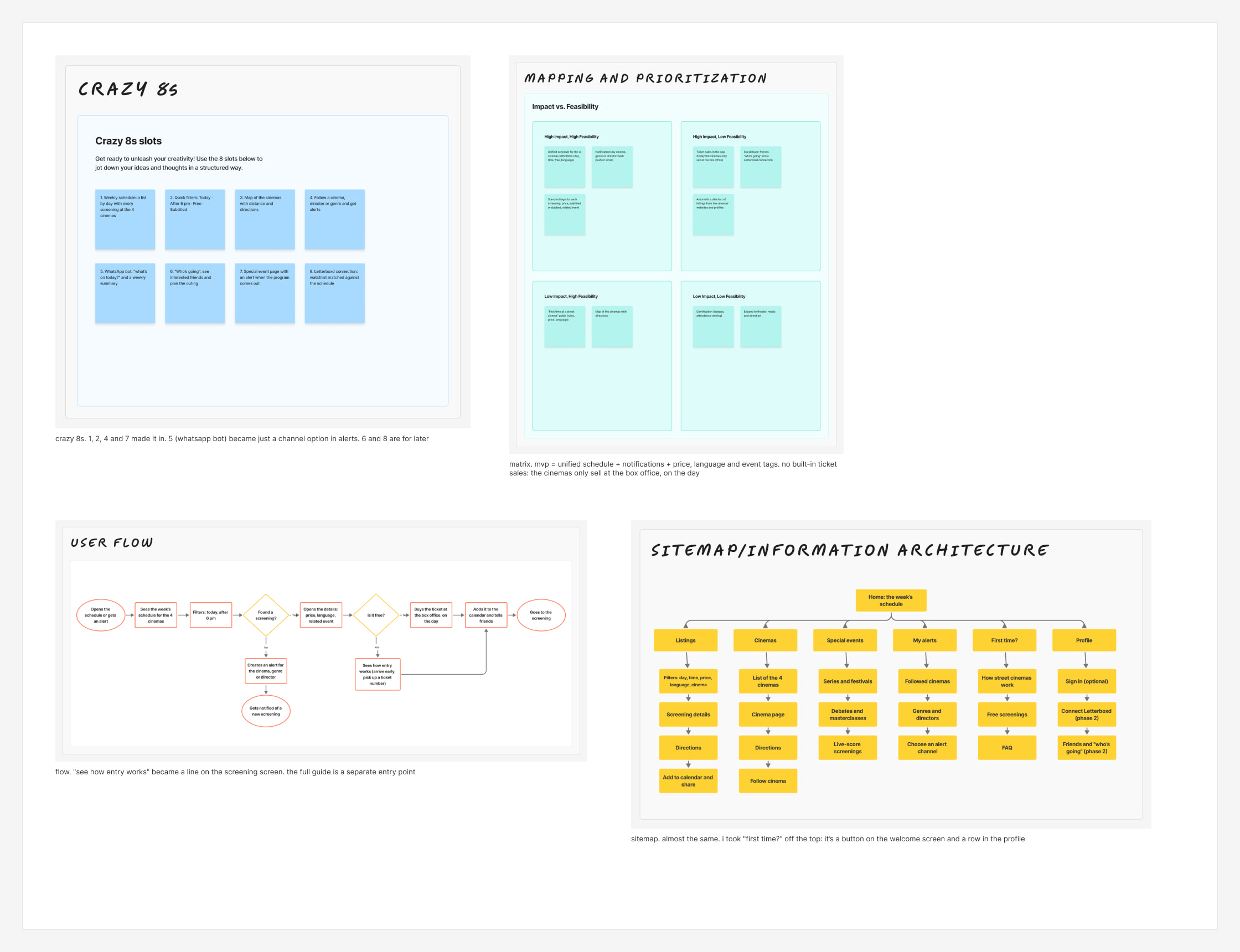
I generated ideas with Crazy 8s, and what made it in was the daily schedule, quick filters, a page for each cinema and alerts by cinema, genre or director. The WhatsApp bot became just one channel option in the alerts, and the cinema map and the Letterboxd connection were left for later. On the impact versus feasibility matrix, the MVP kept the unified schedule, the notifications and the price, language and event tags. Ticket sales didn’t make it, because the four cinemas only sell tickets at the box office, on the day of the screening.
Crazy 8s, prioritization matrix, flow and sitemap, with notes on what made it in and what was left out.
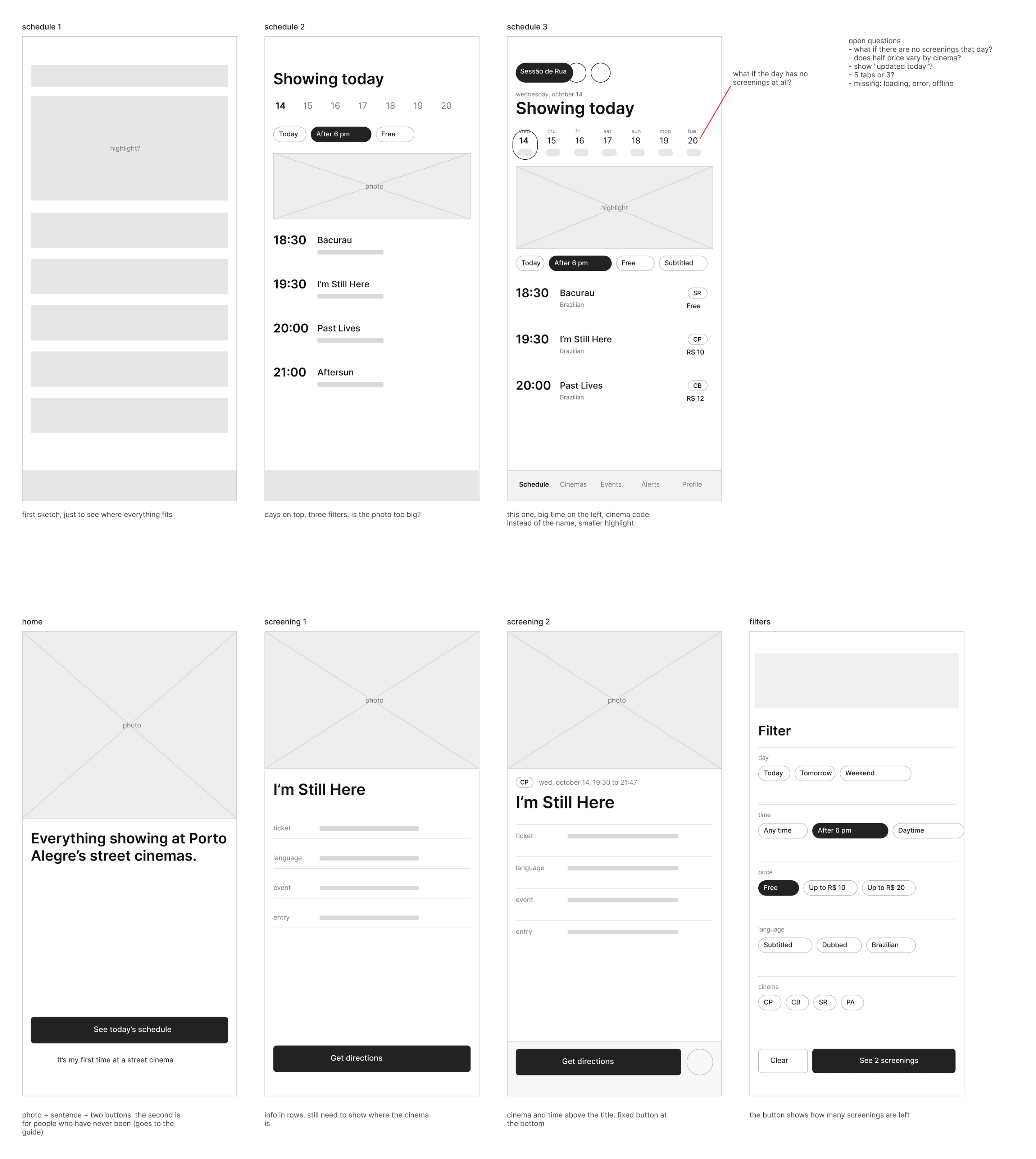
Before the interface, I sketched the screens as wireframes, each with a note on what to change in the next version. The schedule went through three versions before landing on the large time on the left and the smaller highlight, and the open questions (a day with no screenings, half-price tickets per cinema, loading and error states) are noted alongside.
Wireframes of the schedule, home, screening and filters, with notes on each version.
From insight to screen
Each research finding became a decision and a screen in the prototype.
What the research showed
What the app does
Where it shows up
63% had missed a screening because they didn’t know it existed
One schedule with the four cinemas together, by day and time
Schedule and Filters
21 of 30 prefer to hear about it on Instagram, but in the interview the cinemas’ posts didn’t reach their followers
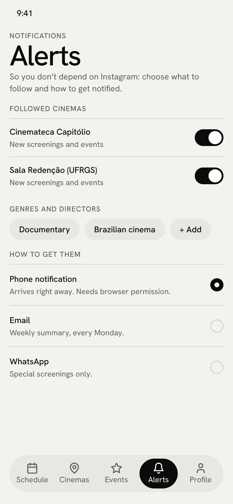
The app’s own alerts, by cinema, genre or director
Alerts
Showtime matters as much as price when choosing
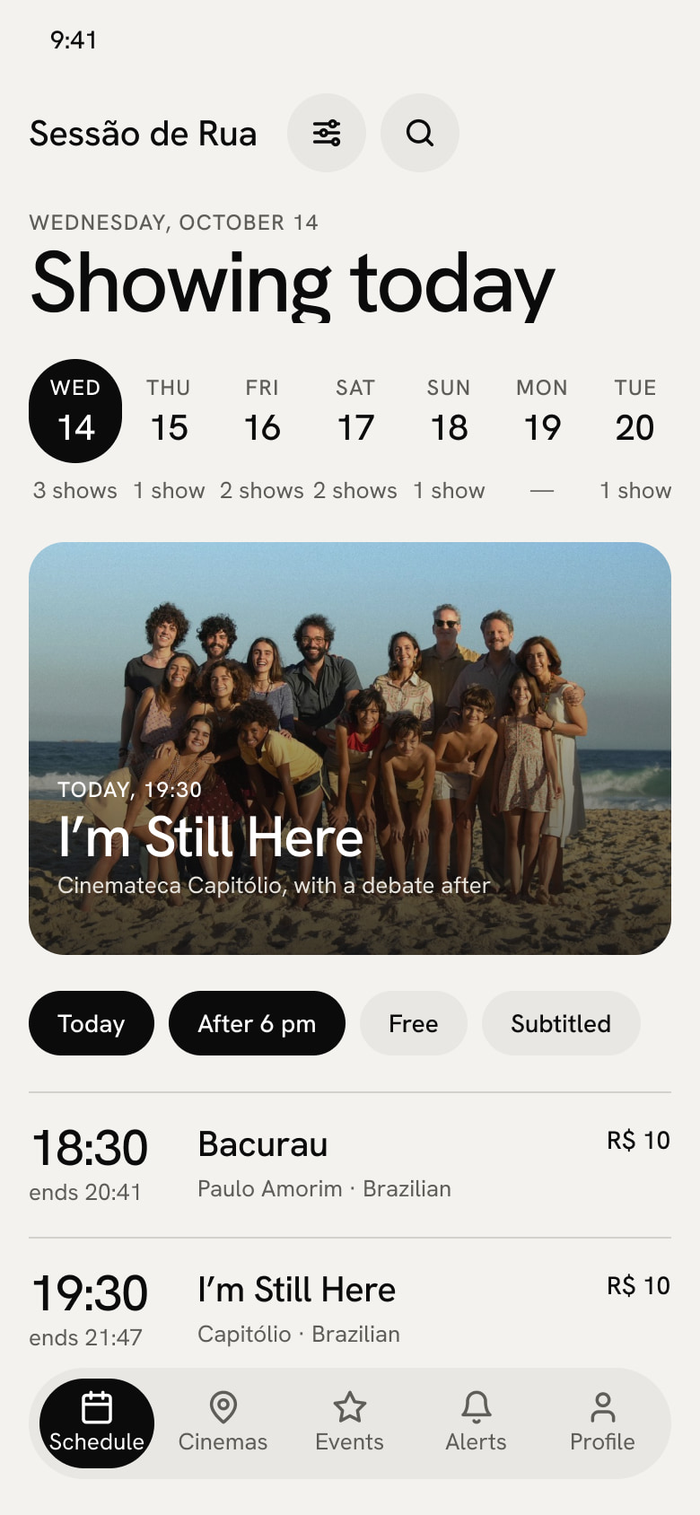
The time is the largest number on the row, and you can filter what’s on after 6 pm
Schedule and No results
People need to know the price, the language and whether there’s a debate before leaving home
Each screening shows this in the list and in the details
Schedule and Screening
The cinemas only sell tickets at the box office, on the day of the screening
The screening says so, and the main action is getting directions
Screening
90% go to multiplexes and only 37% to street cinemas
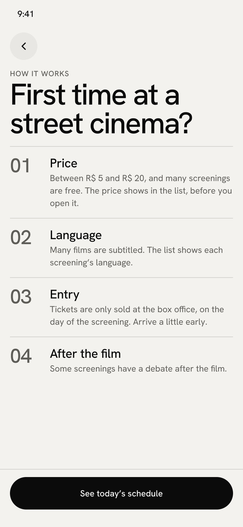
A short guide for first-timers, available from the first screen
Welcome and First time
A friend’s recommendation weighs on the choice (57%)
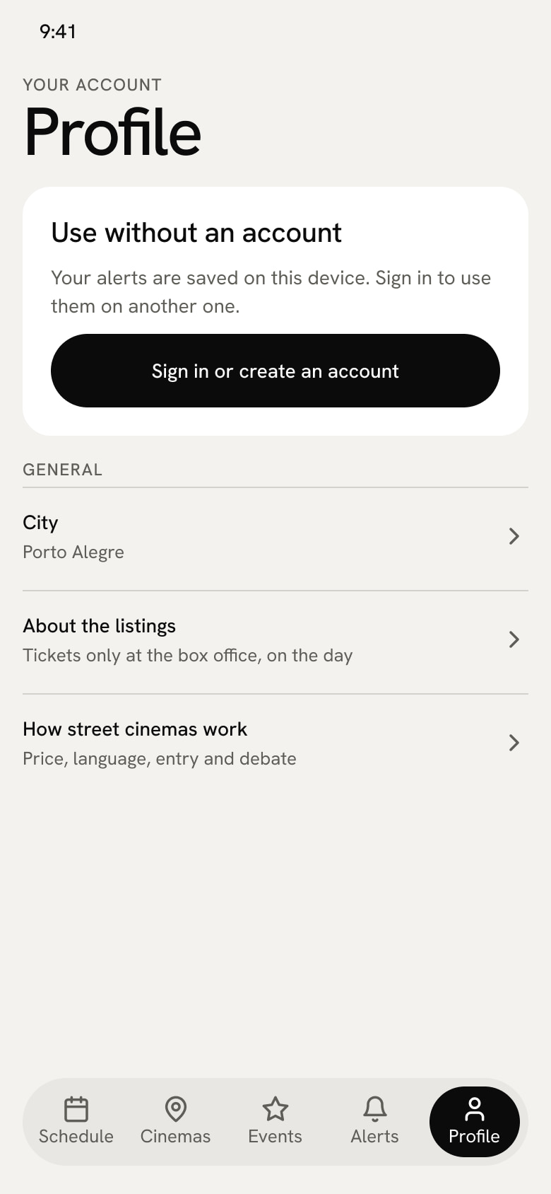
Letterboxd and “who’s going” are left for later
Profile
Free screenings and festivals don’t show up anywhere
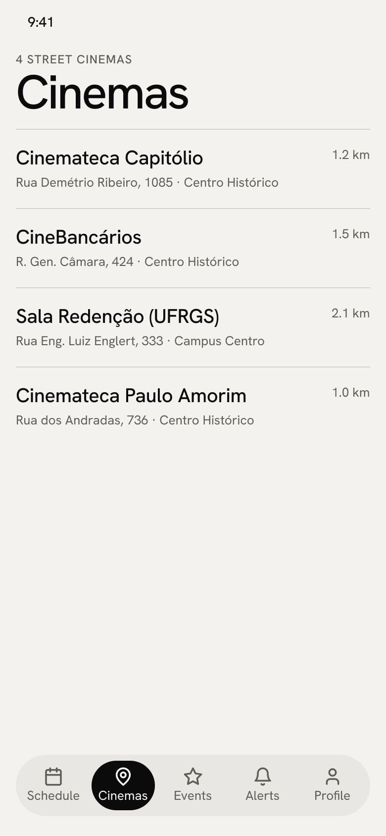
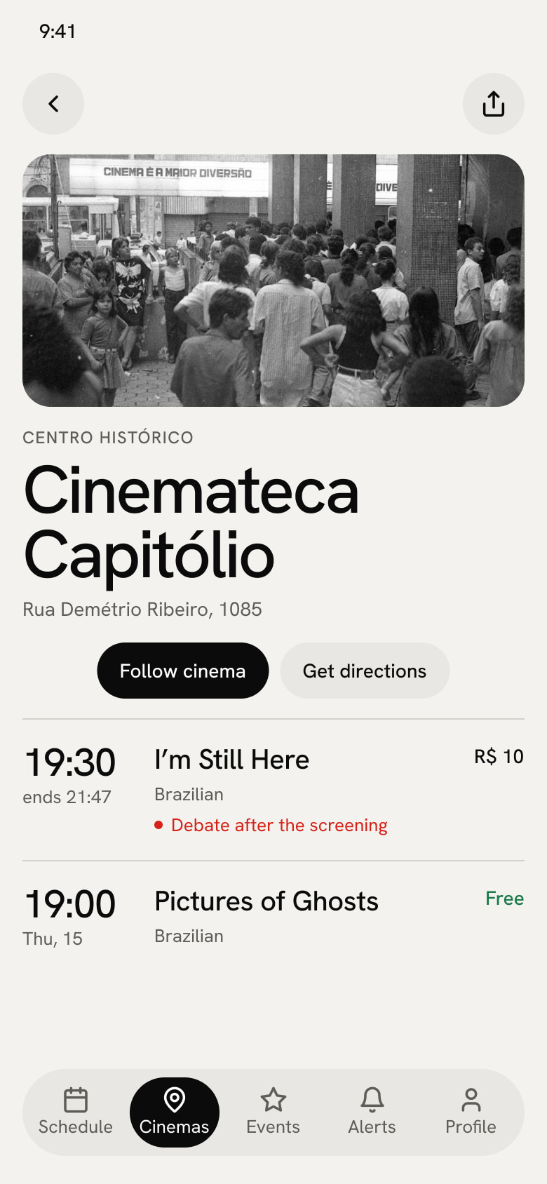
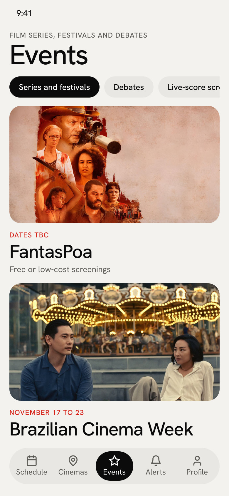
An events tab and a page for each cinema
Cinemas, Cinema and Events
References and foundations
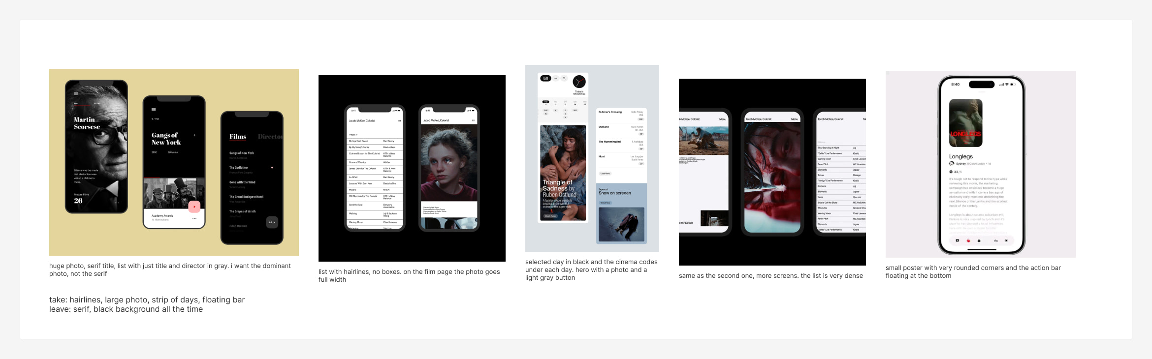
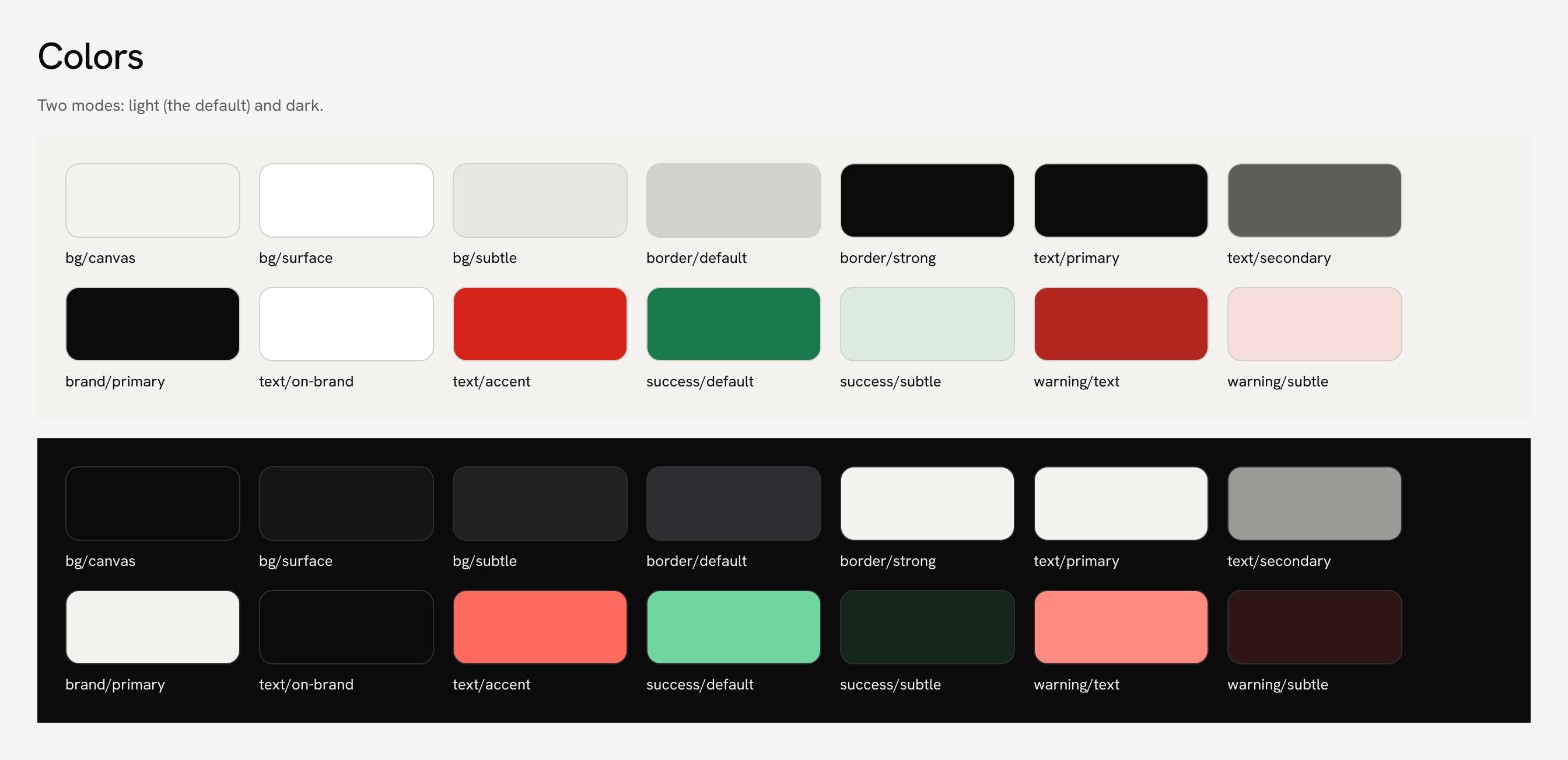
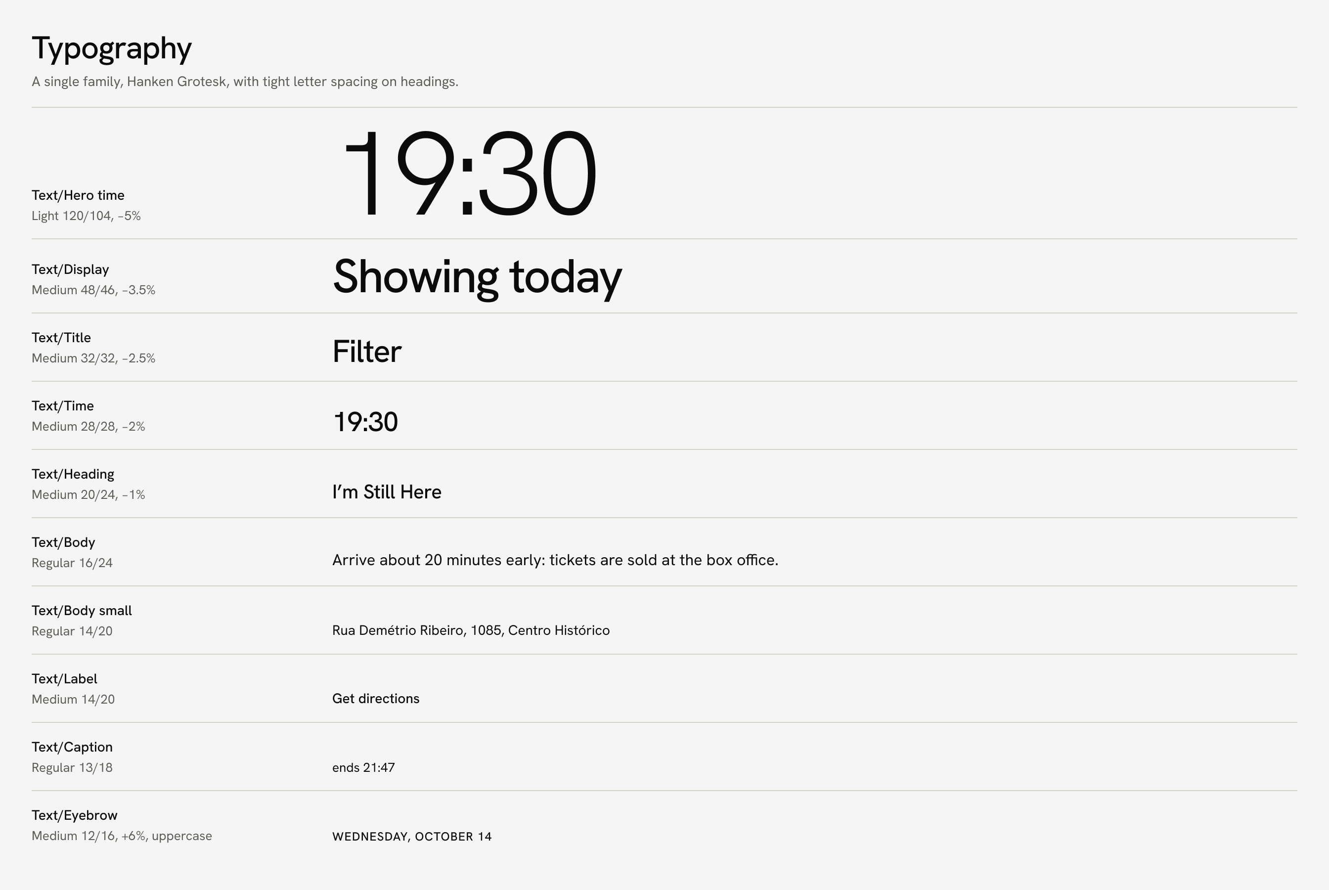
I started from five references of cinema apps and websites I saved on Cosmos and took a single thing from each: the large photo, the list with hairlines, the strip of days and the floating bar. The app uses few colors, large type, hairlines and one large photo per screen, in light and dark mode, with a single typeface, Hanken Grotesk.
The references and what I took from each one.Colors in both modes.Type scale: the time is the largest number on the row.
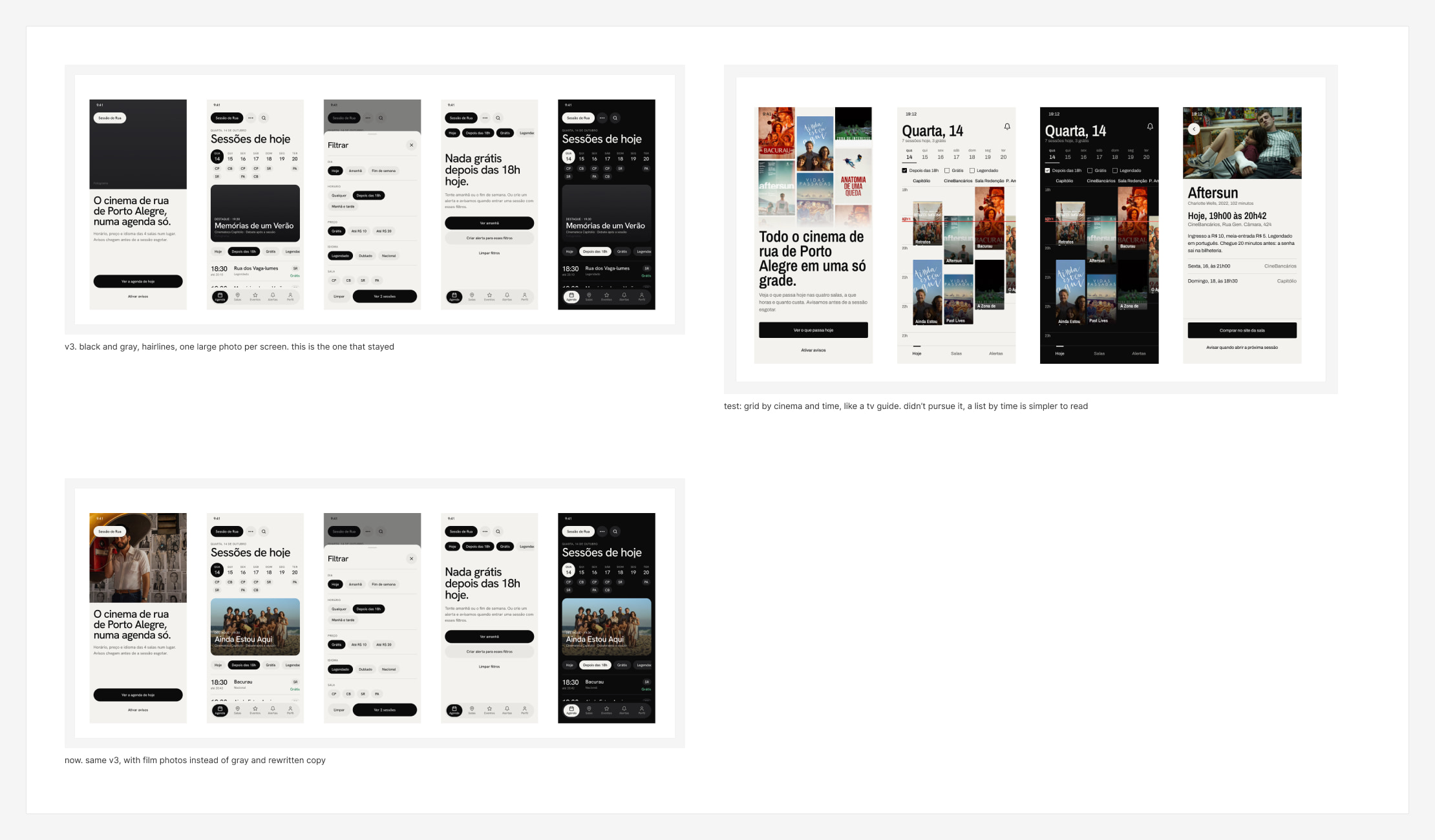
The rules I followed fit in four lines: one large photo per screen, hairlines instead of boxes, black and gray with red only for highlights, and time and cinema first. Every text color pair passes AA contrast in both modes, and the lowest value in light mode is 4.6:1. I discarded the first, more decorated version of the layout, and I also tested a grid by cinema and time, like a TV guide.
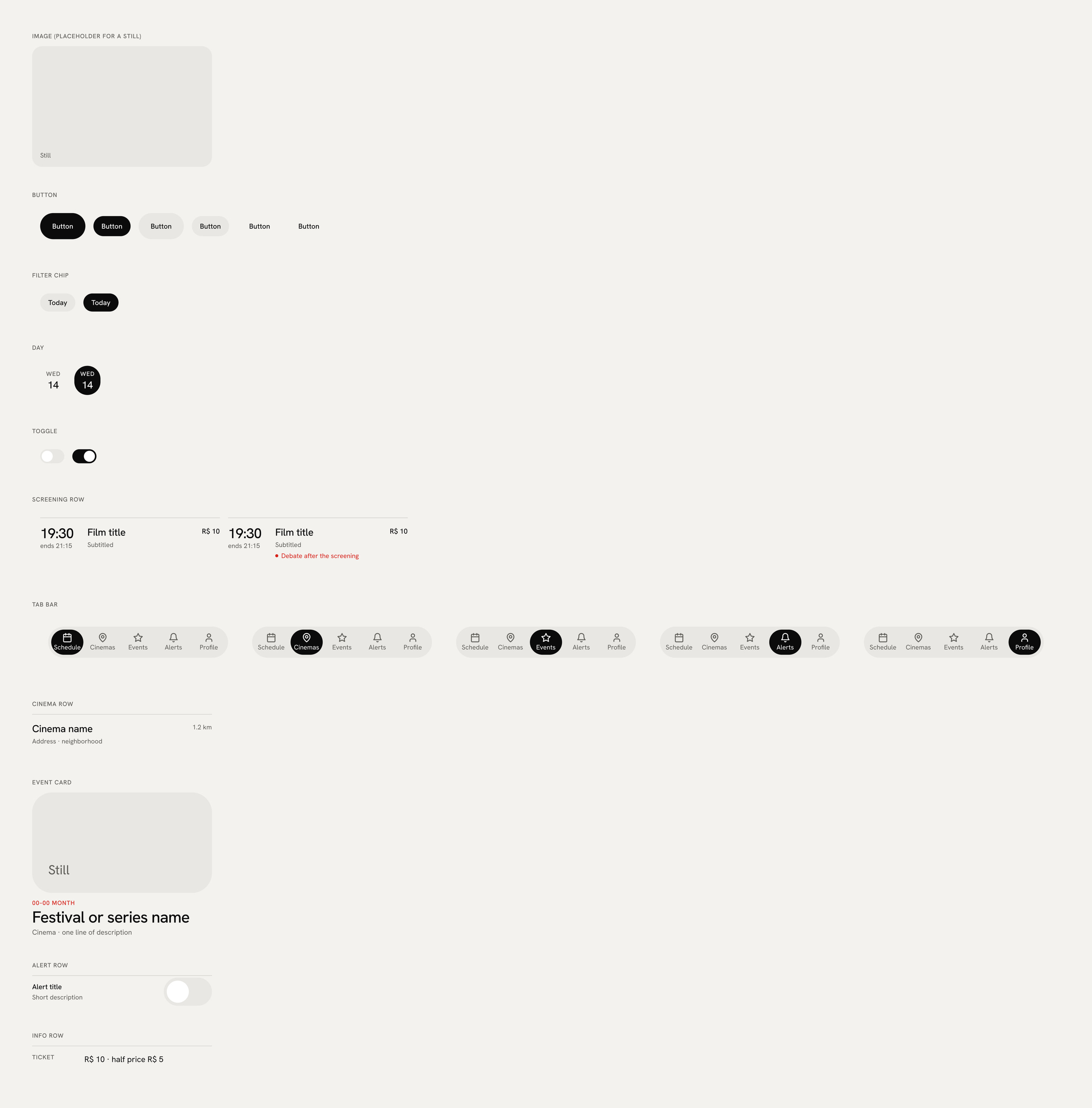
The versions: v3 in black and gray, the grid test by cinema and time, which I didn’t pursue, and the current version. These earlier screens are in Portuguese.The component library.
The 12 screens
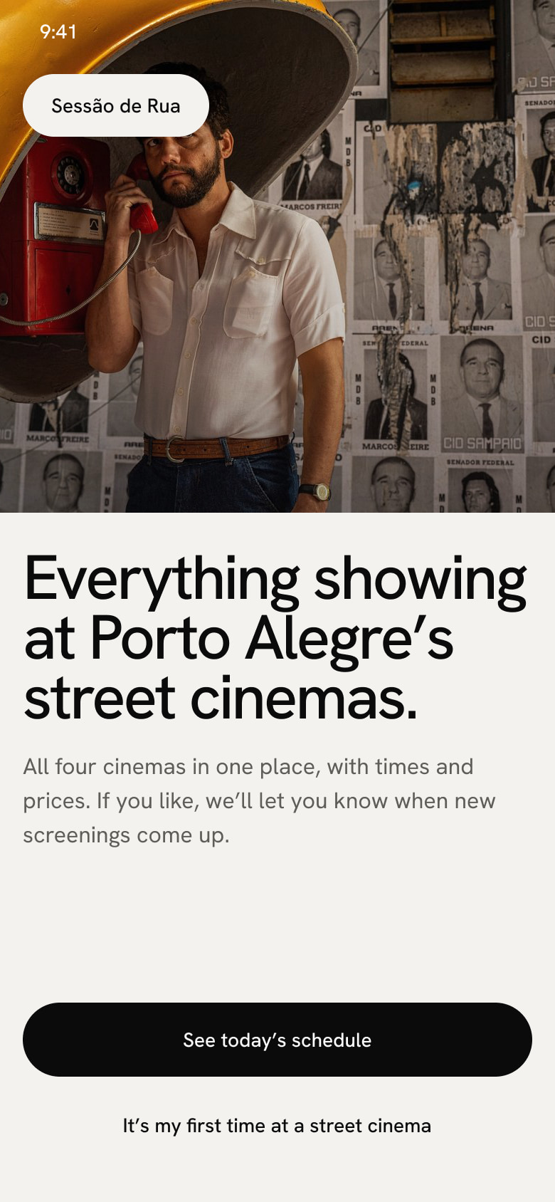
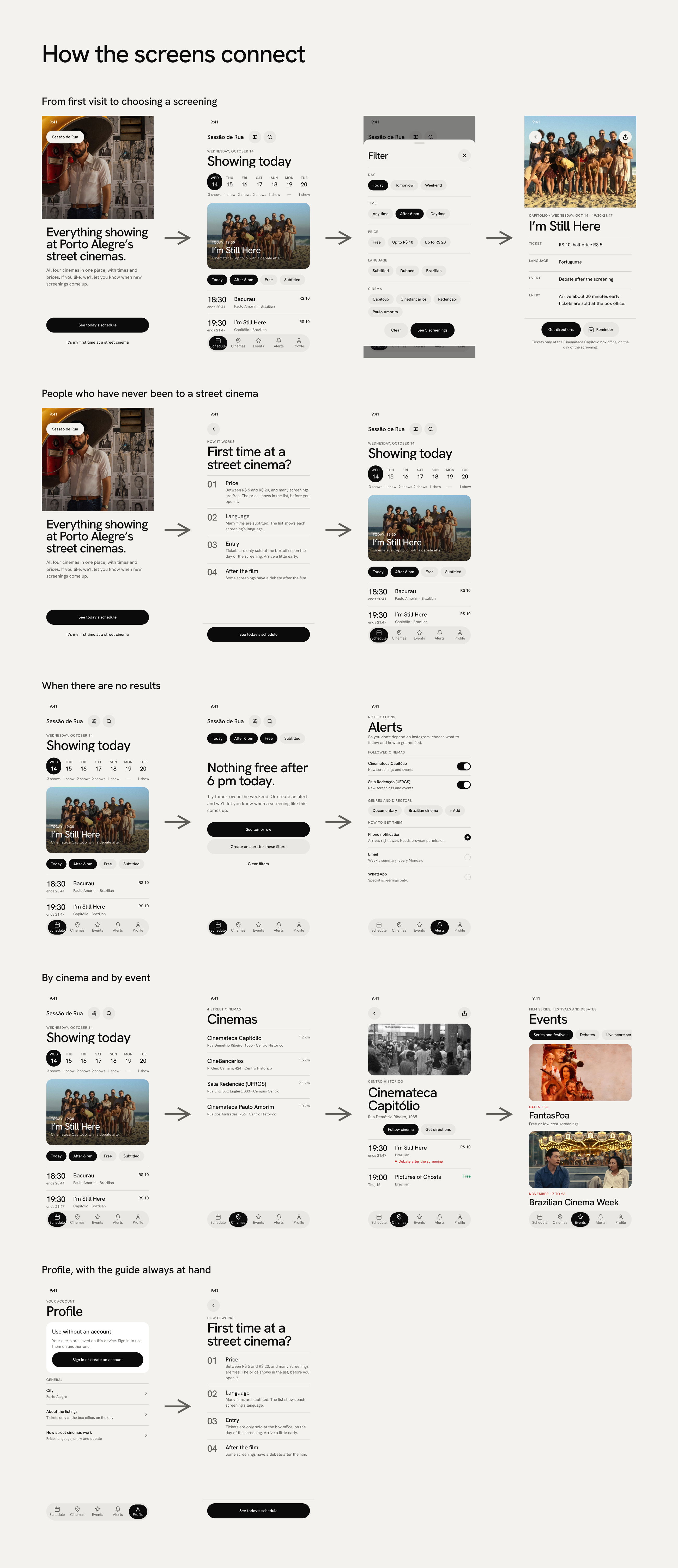
The prototype has 12 screens across three journeys: get in and find a screening, decide and go, and keep coming back. The films and images are real, posters and stills from TMDB used only in this prototype, as are the cinemas, addresses and channels. The showtimes, prices and distances are made up, and the name is provisional.
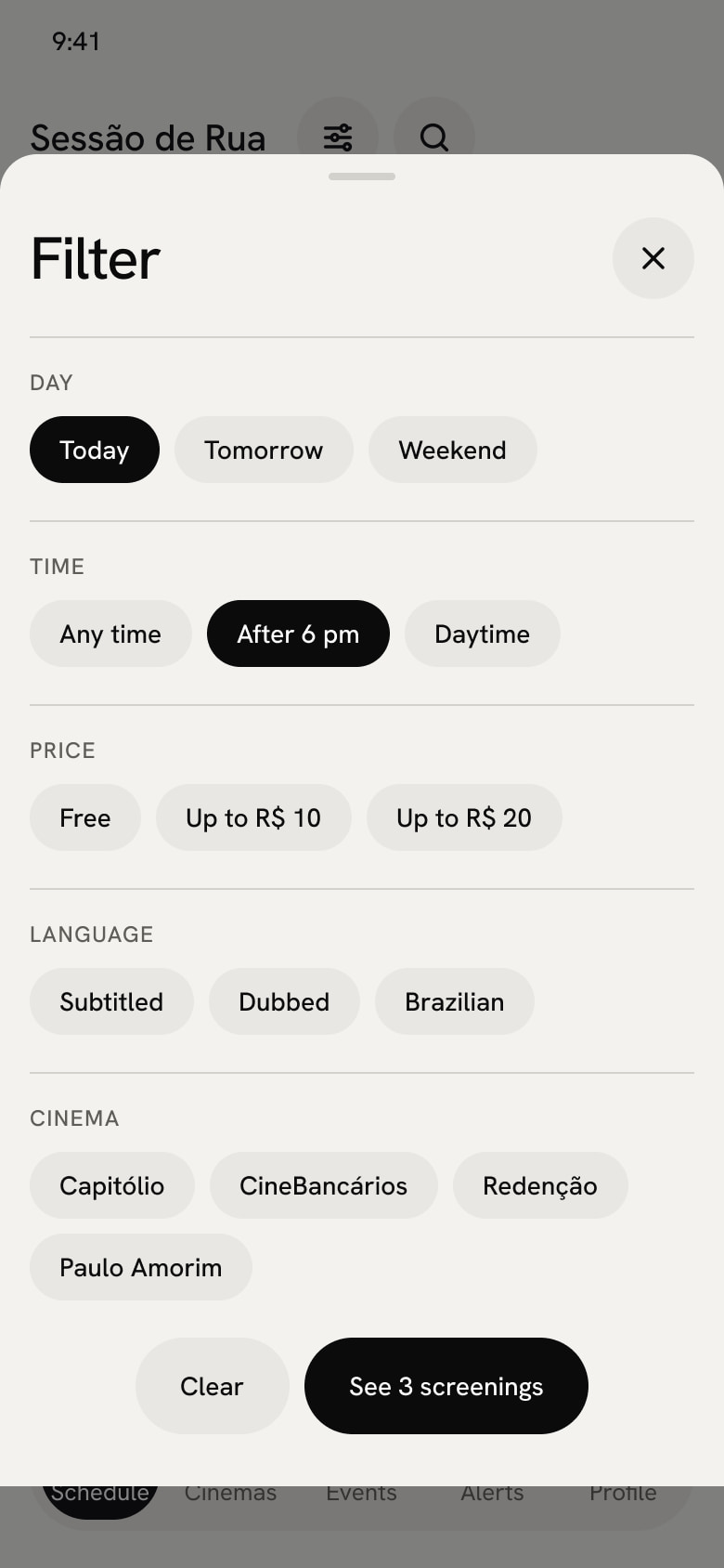
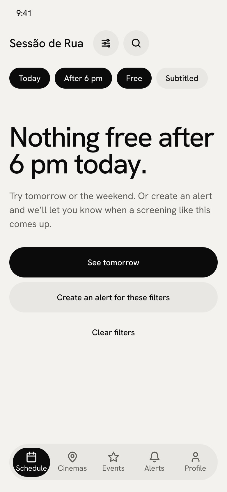
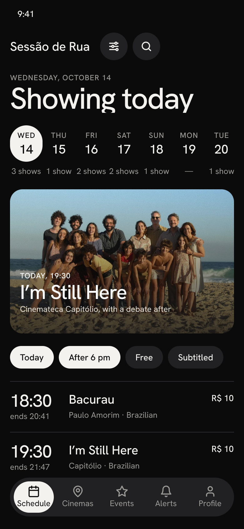
01 Welcome02 Schedule03 Filters04 No results05 Schedule in dark mode
2 · Decide and go
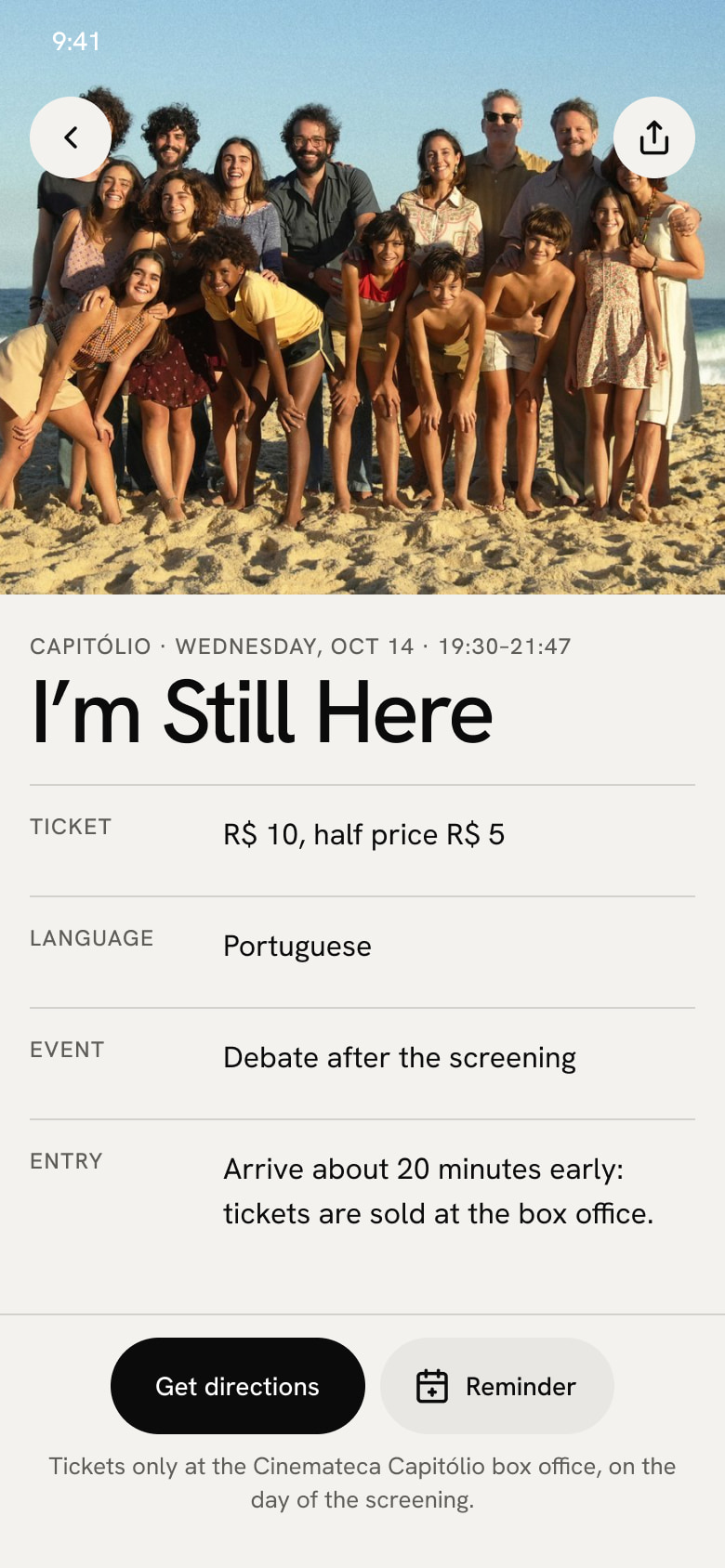
06 Screening details07 Cinemas08 Cinema page09 Special events
3 · Keep coming back
10 Alerts11 First time at a street cinema12 Profile
How the screens connect.
Decisions
A list by time instead of a grid by cinema and timeWhat I saw
12 of 30 people mention lack of time and 13 choose a screening by its time. I tested a grid by cinema and time, like a TV guide.
What I decided
Keep the list by time, with the time as the largest number on the row and the cinema’s name under the film, plus a filter for what’s on after 6 pm.
Why
The list is simpler to read, and people who work need to know first whether the screening fits their routine.
Say where and when to buy the ticketWhat I saw
Porto Alegre’s street cinemas only sell tickets at the box office, on the day of the screening. First-timers don’t know that.
What I decided
The screening screen says tickets are sold at the box office, on the day only, and the main action is getting directions, with a reminder next to it.
Why
The app solves discovery, the most mentioned barrier, and people leave home knowing where and when to buy.
Alerts by cinema, genre or directorWhat I saw
The four cinemas use Instagram as their main channel and 21 of the 30 people prefer to get information there. In the interview, Felipe said the cinemas’ posts don’t reach him. And 24 of the 30 people choose films by genre, and 12 by director.
What I decided
An Alerts screen, with followed cinemas, genres and directors and a choice of channel: phone notification, email or WhatsApp.
Why
The app’s own channel tells people when a screening they care about comes up, without depending on the algorithm.
What I would do differently
Looking back at the research and the prototype, I would change four things.
Recruiting: the survey circulated among people I know and in the course groups, and I already knew both interviewees, one of them from São Paulo. Today I would open the survey with a screener question and interview people who go to the four cinemas.
Questions: “If there were a platform, would you use it?” measures intent. I would also ask how they found out about the last screening they went to.
Data I would use better: 25 of 30 people plan the outing a few days ahead, and the schedule opens on today. 19 of 30 almost always go with someone, and “who’s going” was left for later. And 21 of 30 say the theme or the political angle of a screening weighs on the decision, which the screening details don’t show yet.
Scope: I designed cinemas, events, profile and dark mode before testing the schedule and the alerts, which were the MVP. The next step is a usability test with five people who go to these cinemas, with tasks such as finding a free screening after 6 pm and creating an alert for a director.
Outcome
The project reached a 12-screen clickable app prototype, with the schedule also in dark mode, a component library and a map of how the screens connect. It hasn’t been usability tested yet. Among the findings behind it, 19 of 30 people had missed a screening because they didn’t know about it, and 22 of 30 rate using a platform with the listings of all the independent cinemas 4 or 5. That rating measures intent, in a small convenience sample. Only a usability test will show whether the app solves the problem.