Context
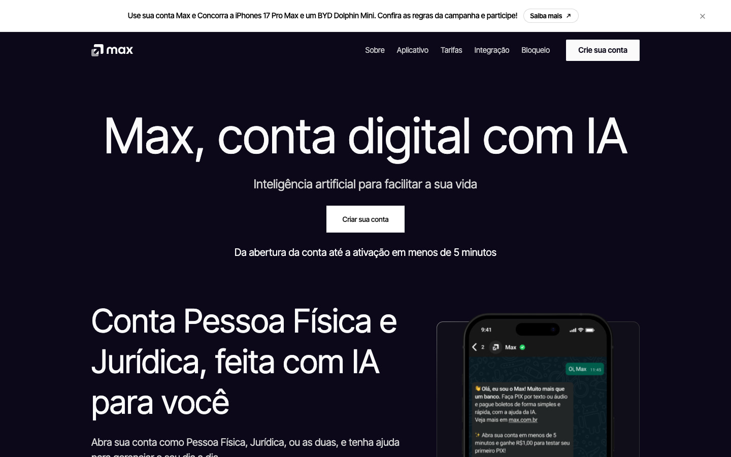
Max is a digital account for individuals and businesses, with an AI assistant. The old homepage listed features. The new one had to explain, in a few seconds, why anyone should open yet another account.
The homepage is in Portuguese, as it was launched for customers in Brazil.
Problem
There are many digital accounts in Brazil, and a list of banking features doesn’t give visitors a reason to pick Max among them. The page also had to serve two audiences, individuals and businesses, without doubling the reading effort.
My role
I was responsible for the design and the code of the Max website and was the only designer on this work. I did the concept, the design in Figma and the page development, all the way to the shipped code.
Process
I treated AI as the product’s identity: Max is both the account and the assistant. The page reinforces this with three pillars: speed (account open in minutes), control (limits, face verification, card blocking) and access (24-hour assistant, no waiting in line).
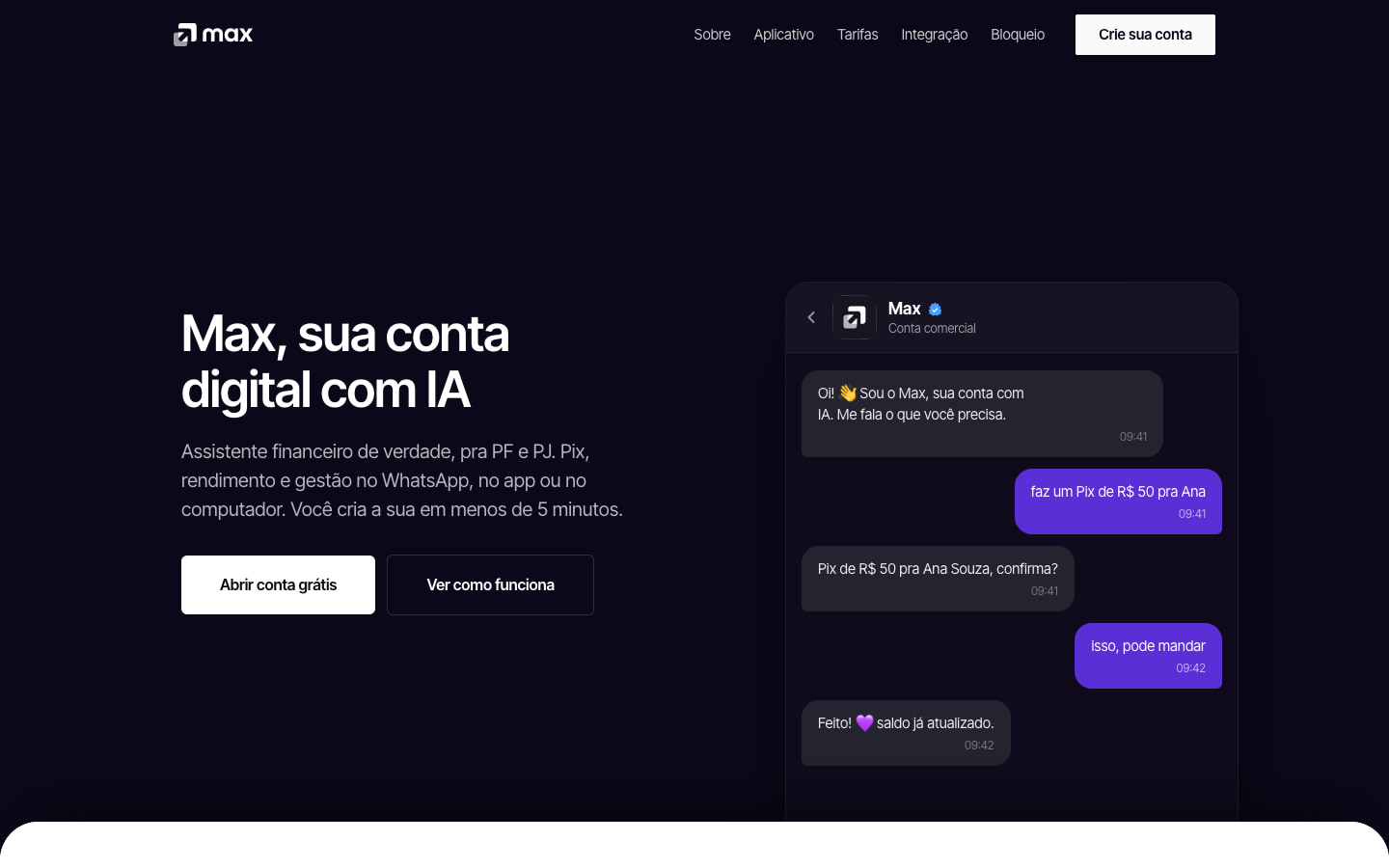
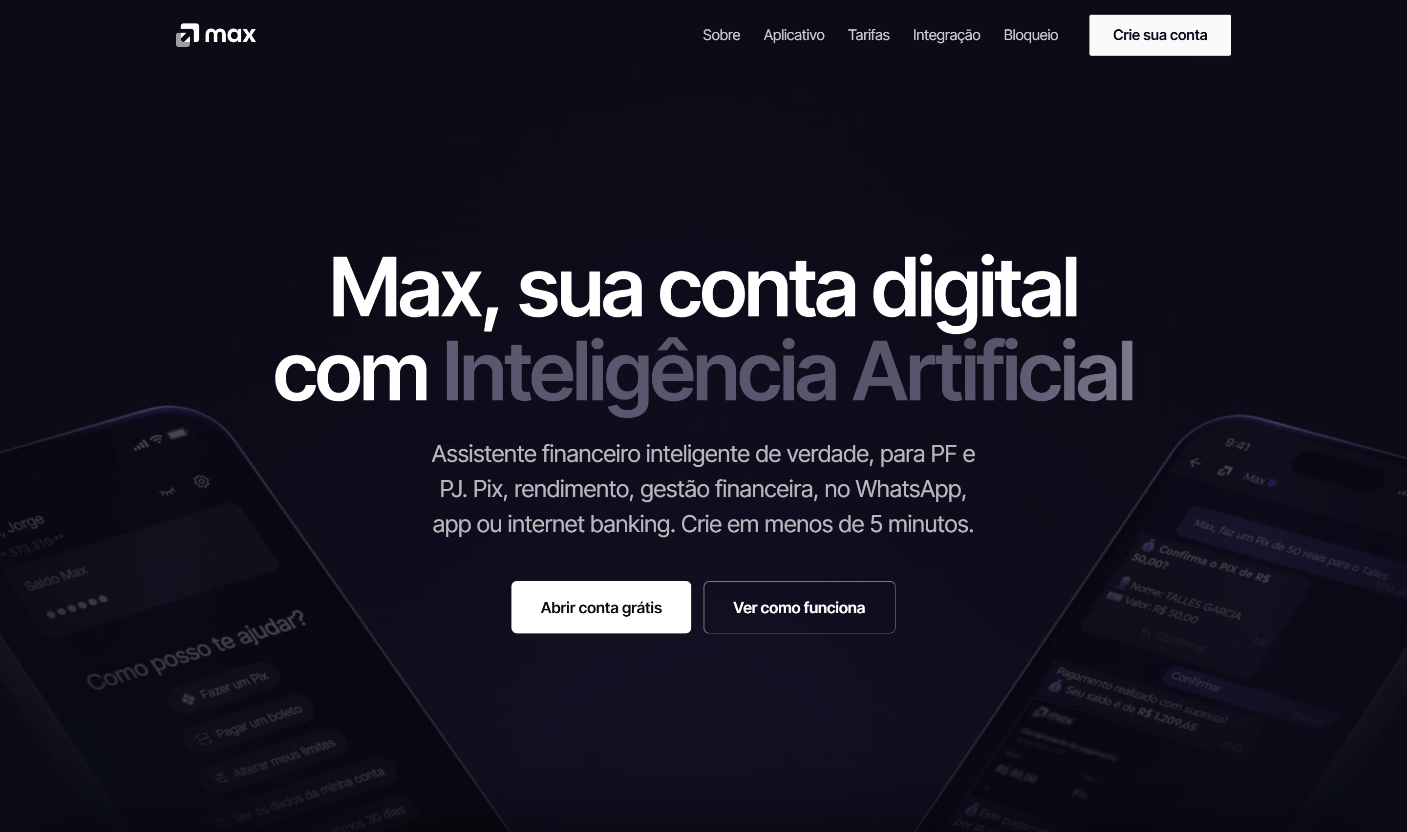
I explored two directions for the top of the page, both already in code. The first split the hero between the headline and a conversation with the assistant. The one chosen has a single sentence, “Max, sua conta digital com Inteligência Artificial” (Max, your digital account with Artificial Intelligence), with the AI term in a silver gradient and phones on video in the background, and the conversation moved down to the next section, in tabs. In the individuals and businesses section, I replaced the carousel of stacked cards with two cards side by side, with a four-step “Abrir é simples” (Opening is simple) walkthrough.