A system shared by the platform, the website and the sign-up flow, built in one week: six principles, tokens with light and dark themes and 42 components, tested on a new product without a single color or style outside the system.
Company
Appmax
Role
Audit, principles, tokens, components and screens
Team
Just me
Timeline
October 1 to 8, 2026
Tools
Figma (variables and modes) and AI, for the technical audit and the assembly
Outcome
File used by the design team, tested on a new product
Context
Appmax runs three products, each with its own interface: the platform, the website and the sign-up flow for new customers. I proposed one design system for all three and tested it on a new product.
The interfaces are in Portuguese, as they were designed for Appmax’s customers in Brazil.
Problem
There was no single system to serve as a reference for the screens of the three products. The goal was to gather in one place the interface decisions, the color, type and spacing values and the components, so that a new screen could use them without deciding everything again.
My role
I did the audit, the principles, the tokens, the components and the screens on my own, from October 1 to 8, 2026. AI handled the technical audit of colors, fonts and spacing and sped up the assembly. The decisions on principles, tokens and components were mine.
Process
Auditing the three products
Before designing anything, I looked at the three products side by side. AI did the technical audit: a browser opened each product and read the colors, fonts, sizes, radii and spacing in the code.
3products audited side by side: platform, website and sign-up
6principles defined before choosing any color or font
6.7:1contrast between the action purple and white text, above the 4.5:1 required for level AA
Discovery roadmap
To organize the discovery for the new system, I built a 10-step roadmap in 4 stages in Figma, based on Meiuca’s Design System Specialist method and on activities from Liga DS. The steps go from stakeholders, naming and tech discovery to the style and component inventories, the visual concept, the tokens, the component design, the handoff and the documentation architecture. Every step follows the same template: why it exists, what it produces, who is best suited to do it and the common mistake, with questions to answer and tips. That week I did the inventory, token and component steps. Stakeholders, handoff and documentation were left for the next stage.
Principles before color
Before choosing a color or a font, I defined how the screens should work. There are six principles, each with the heuristic behind it and the tokens and components where it shows up. When two screen proposals disagree, the principles decide.
Principle
In practice
Why
Money comes first
Large amount in reais, smaller cents, green only for incoming money
The eye goes first to what is biggest (visual hierarchy)
One main action per screen
A single filled button; everything else in gray or as a link
When only one action stands out, the next step is clear (visual hierarchy)
Less visual noise
Light weights and one accent color, only for actions and states
What is different draws attention, so only actions and states get color (Von Restorff effect)
Concrete data on screen
Date, customer, source and status on every row
People decide by looking at each row, without remembering another screen (recognition rather than recall)
No surprises
Fee, timing and consequence before confirmation
Prevents errors before confirmation and shows the operation’s status (error prevention and visibility of system status)
Accessible by default
AA contrast, visible focus, labels always visible and 40 px targets in the dashboard and 48 px in sign-up and on mobile, above the 24 px WCAG 2.2 requires
Contrast and focus come from WCAG 2.2; bigger targets are easier to hit (Fitts’s law); Brazil’s Inclusion Law requires accessible websites (Lei Brasileira de Inclusão, art. 63)
Tokens and components
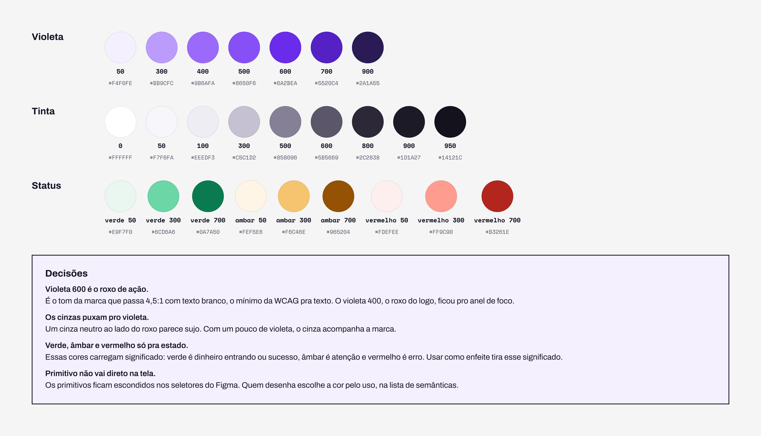
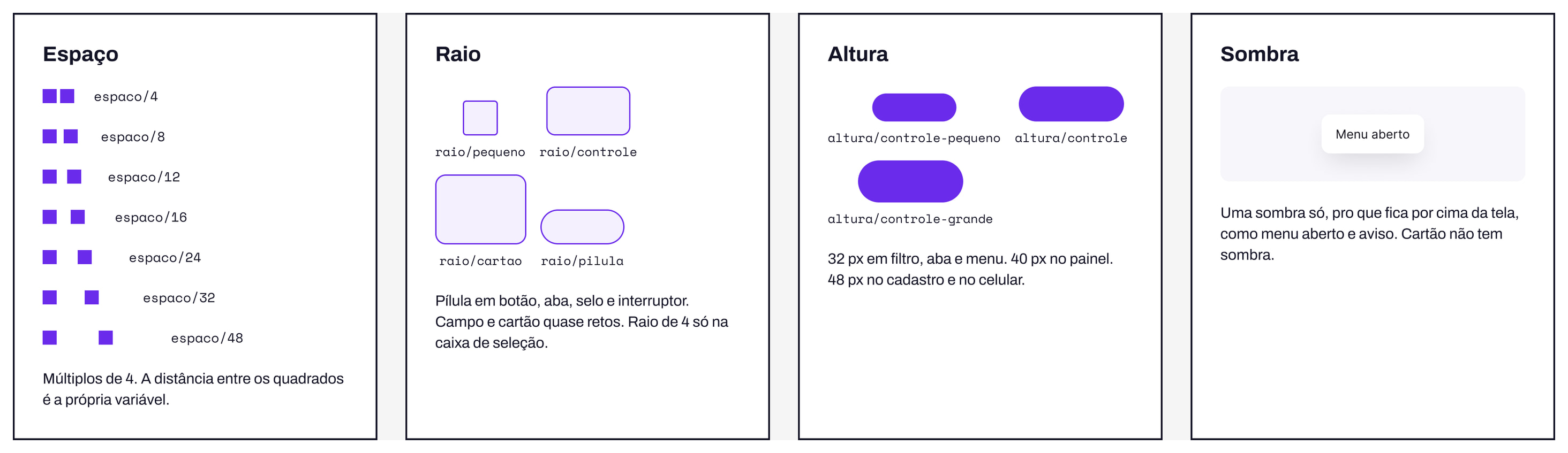
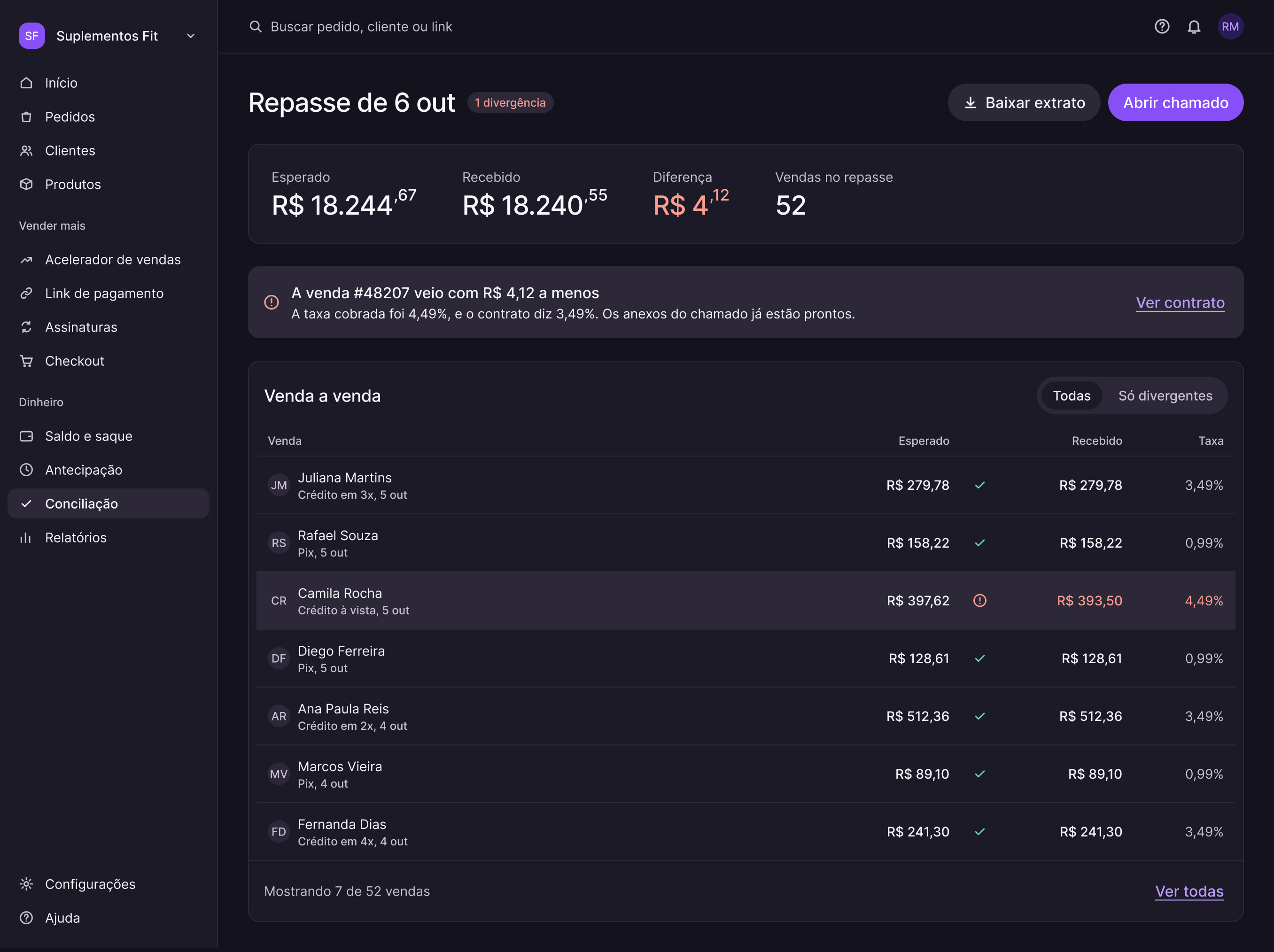
Primitive colors (violet, ink and status) feed the semantic colors, which have a light mode and a dark mode. Spacing in multiples of 4, four radii with defined uses, three control heights and a single shadow, for whatever sits on top of the screen. On top of that, 42 components, each with when to use it, what to avoid and how it looks in dark mode.
Color primitives: violet, ink and status. The action purple is violet 600, and primitives never go straight onto a screen.Spacing, radius, height and shadow. The contrast of each semantic pair was checked in both themes.The Button variants, in the light and dark themes.
Existing screens, rebuilt
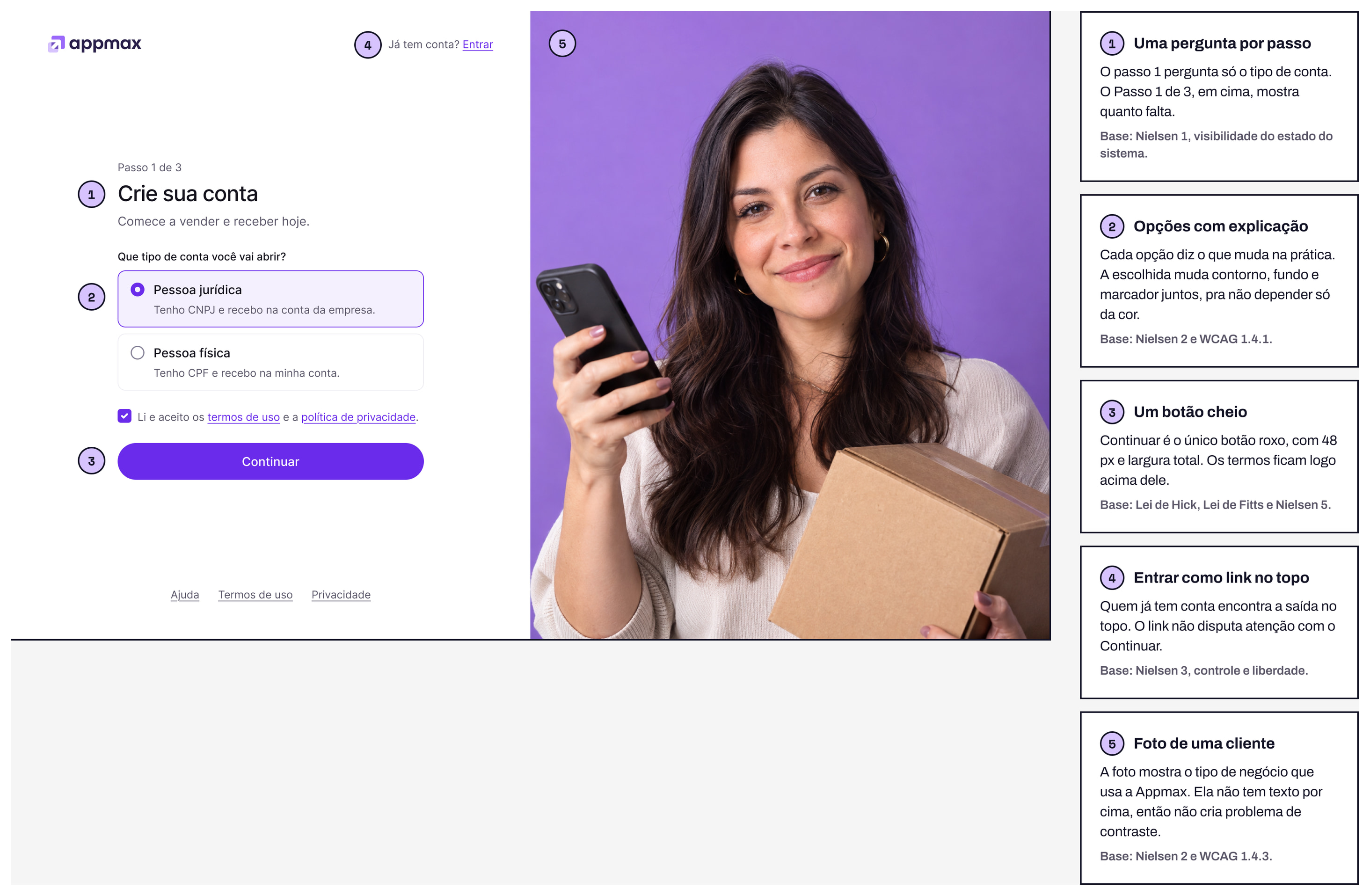
Rebuilding real screens shows whether the pieces hold up. I rebuilt the sign-up flow using only components and tokens.
The sign-up flow rebuilt with the system. Each number marks a decision, explained alongside.
Testing the system: a new product
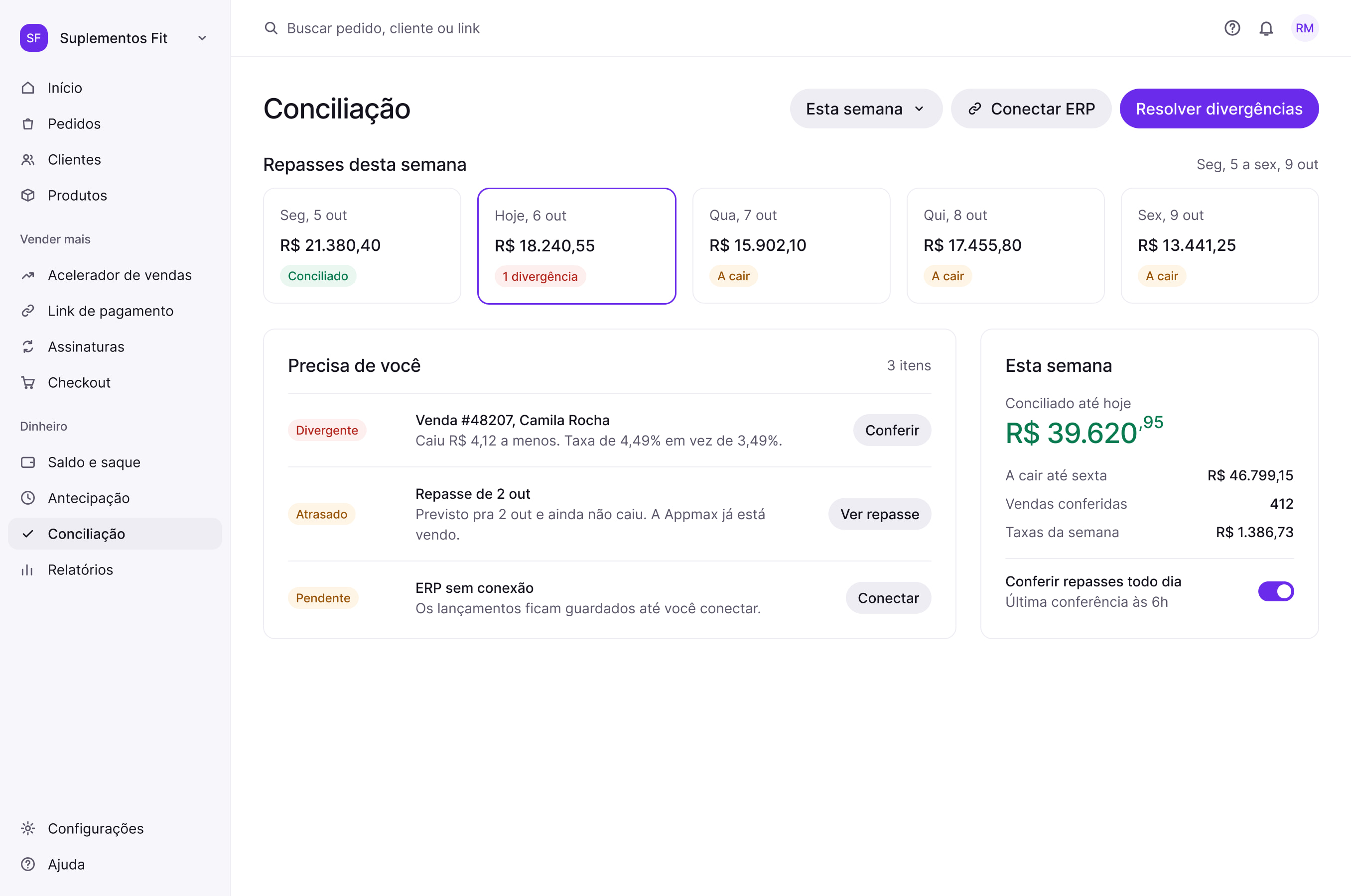
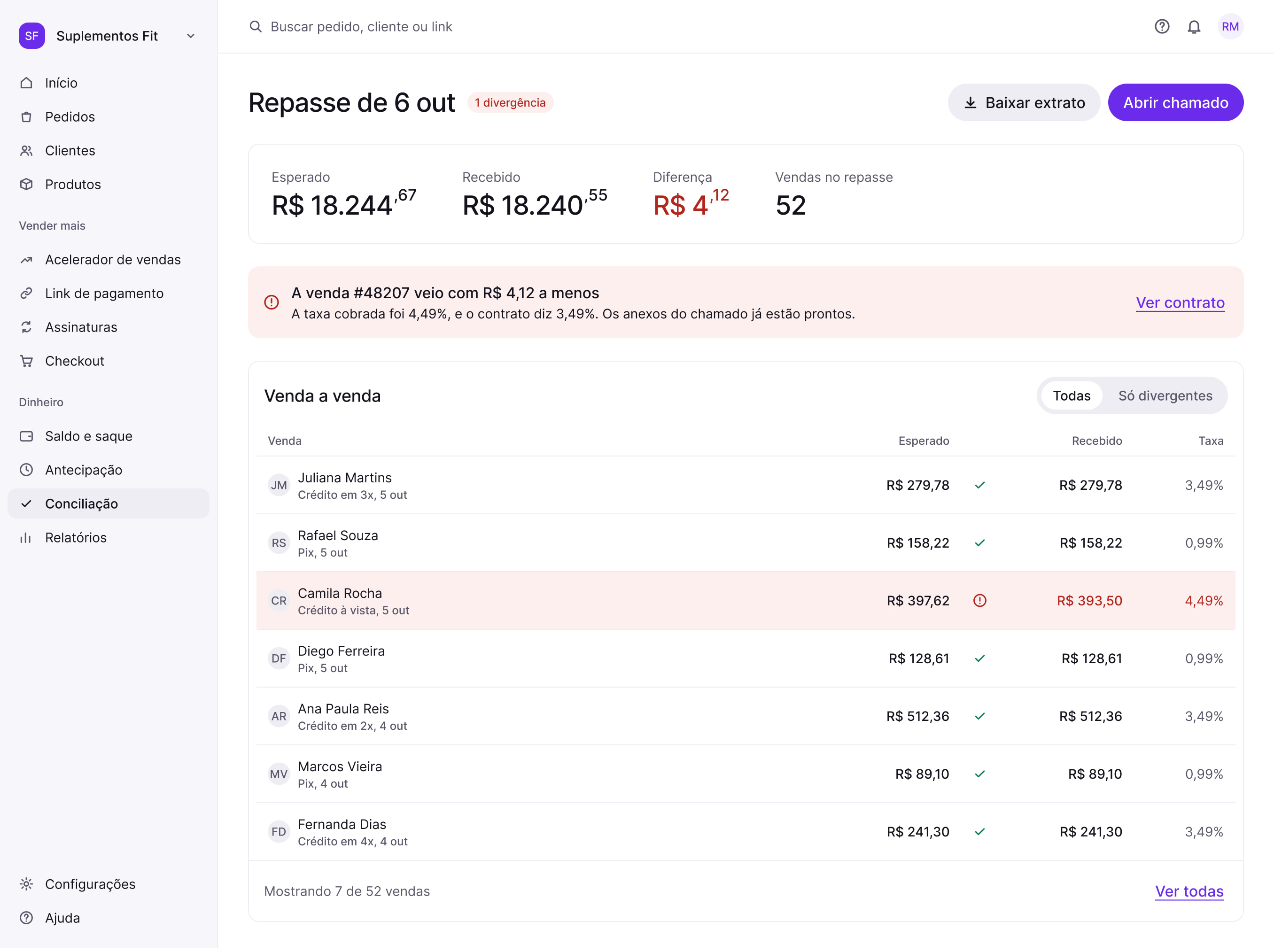
To test the system beyond the screens that already existed, I created Conciliação, a fictional product that matches each sale with the payout that landed in the account. The pain point came from a real process in merchants’ finance teams, done by hand in spreadsheets. The references were Stripe’s and Adyen’s reconciliation reports.
Daily view: what to do today.
Review in the light theme: where the difference is.The same screen in the dark theme. No color was swapped by hand: each component pulled the value from the mode.
Decisions
The amount in reais comes firstWhat I saw
On the sales platform, the amount in reais is the most important information on most screens.
What I decided
Show the amount at 40 px, with smaller cents, and use green only when money is coming in.
Why
The eye goes first to what is biggest, so people see the amount before any other data on the screen.
One main action per screenWhat I saw
Each screen exists for one main action, such as resolving mismatches in Conciliação.
What I decided
A single filled button per screen. Other actions are gray buttons or links.
Why
With fewer choices competing, it’s clear what to do next.
Contrast and target size as the floorWhat I saw
The action purple didn’t pass AA contrast with white text.
What I decided
An action purple with 6.7:1 contrast against white text, and every color pair checked in both themes. Click targets are 40 px in the dashboard and 48 px in sign-up and on mobile, above the 24 px WCAG 2.2 requires (criterion 2.5.8). On mobile, 48 px meets what Apple (44 pt) and Material (48 dp) recommend for touch.
Why
Button text has to be readable for everyone, and a bigger target is easier to hit.
Outcome
The design team started working in the system’s file.
In the system test, Conciliação was built with three page types (daily view, review and step-by-step flow), 20 existing components and no color or style outside the system.